121 Therry Street, Melbourne CBD
(Queen Victoria Market)
c/o
We are Humble PTY. LTD.
AN
Operator 25
Project
2021

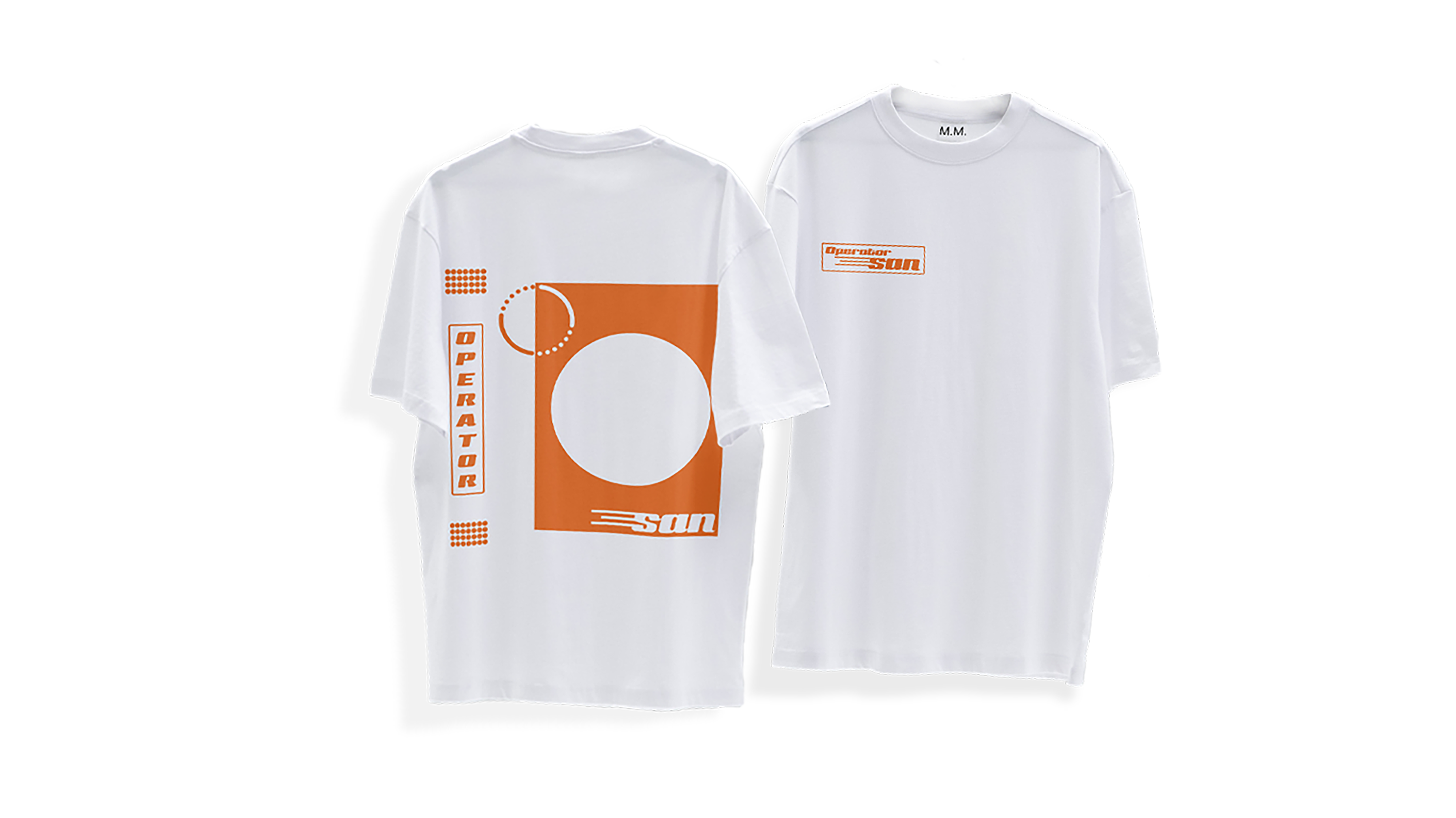
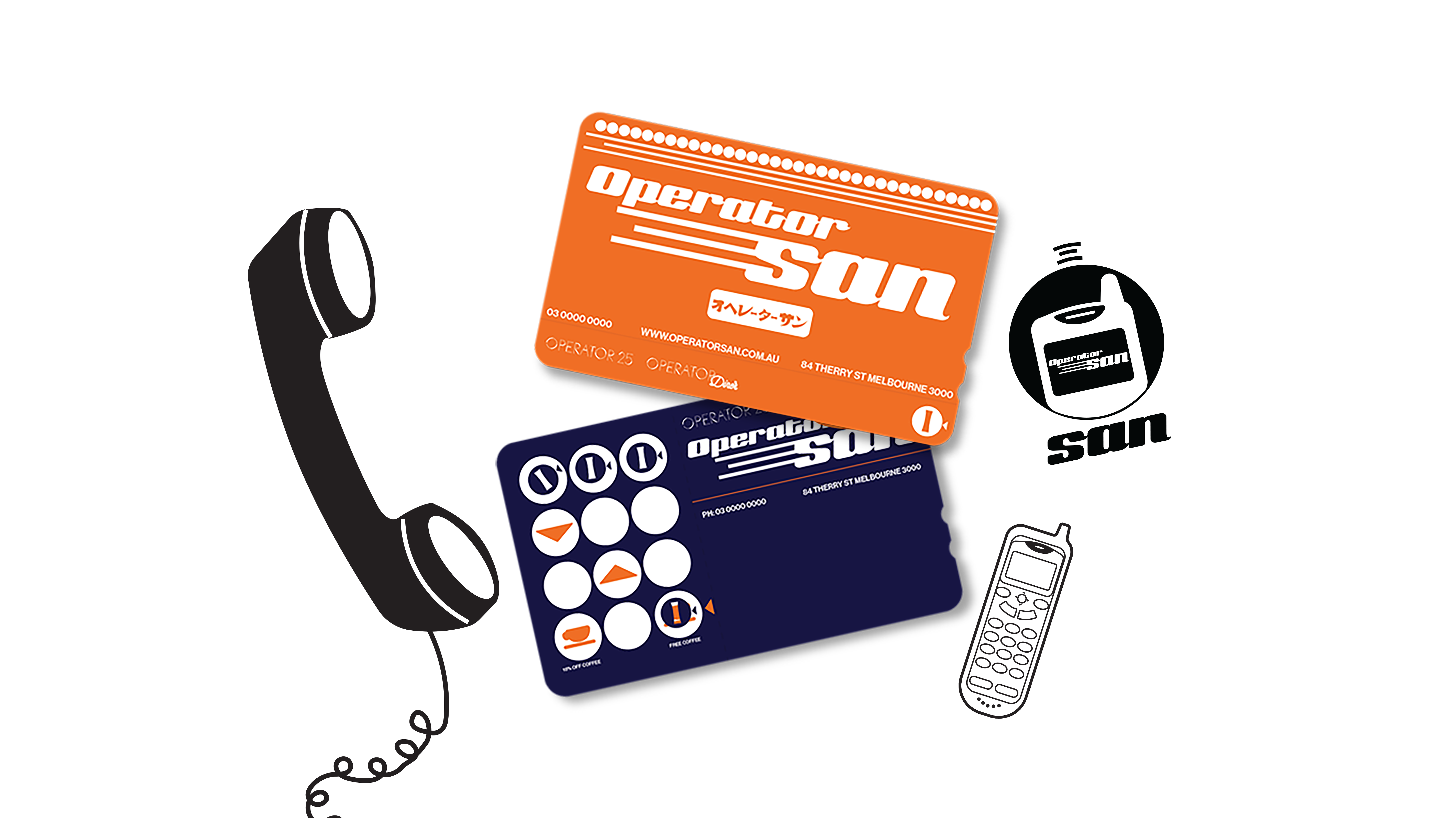
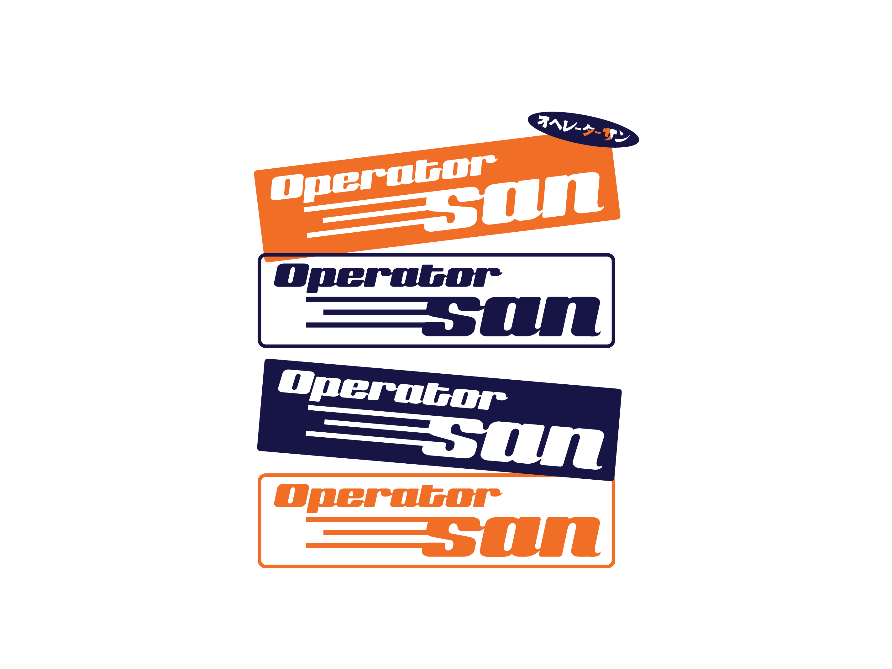
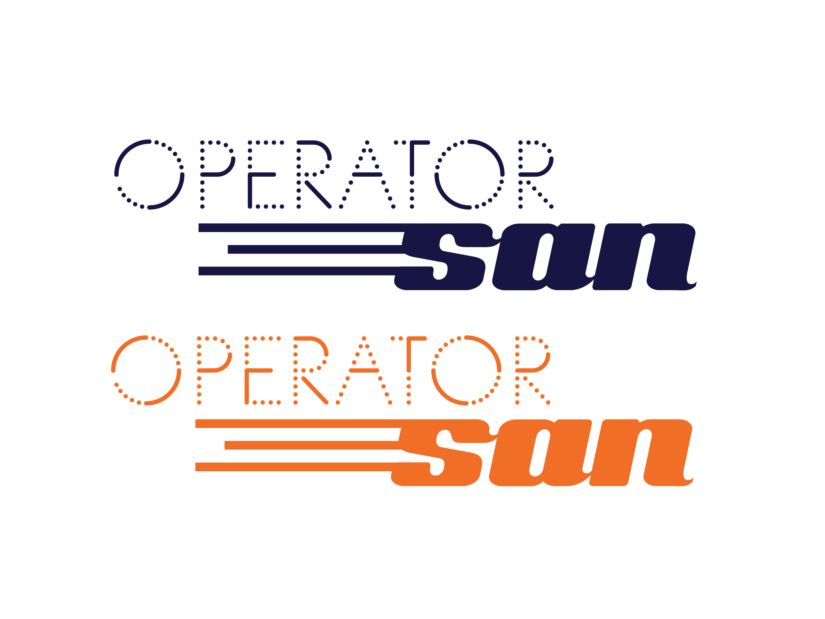
San, a new persona from our friends at Operator 25, is their Japanese counterpart in the hustle and bustle of the newly revamped Queen Victoria Market precinct. The name ‘San’ has a dual meaning: in Japanese, ‘san’ signifies three but is also an honorific suffix applied after a surname in a formal setting. The speed lines zooming off the ‘S’ in the San logo were inspired by the character for three, while also adding a vintage sporty feel to the logo.
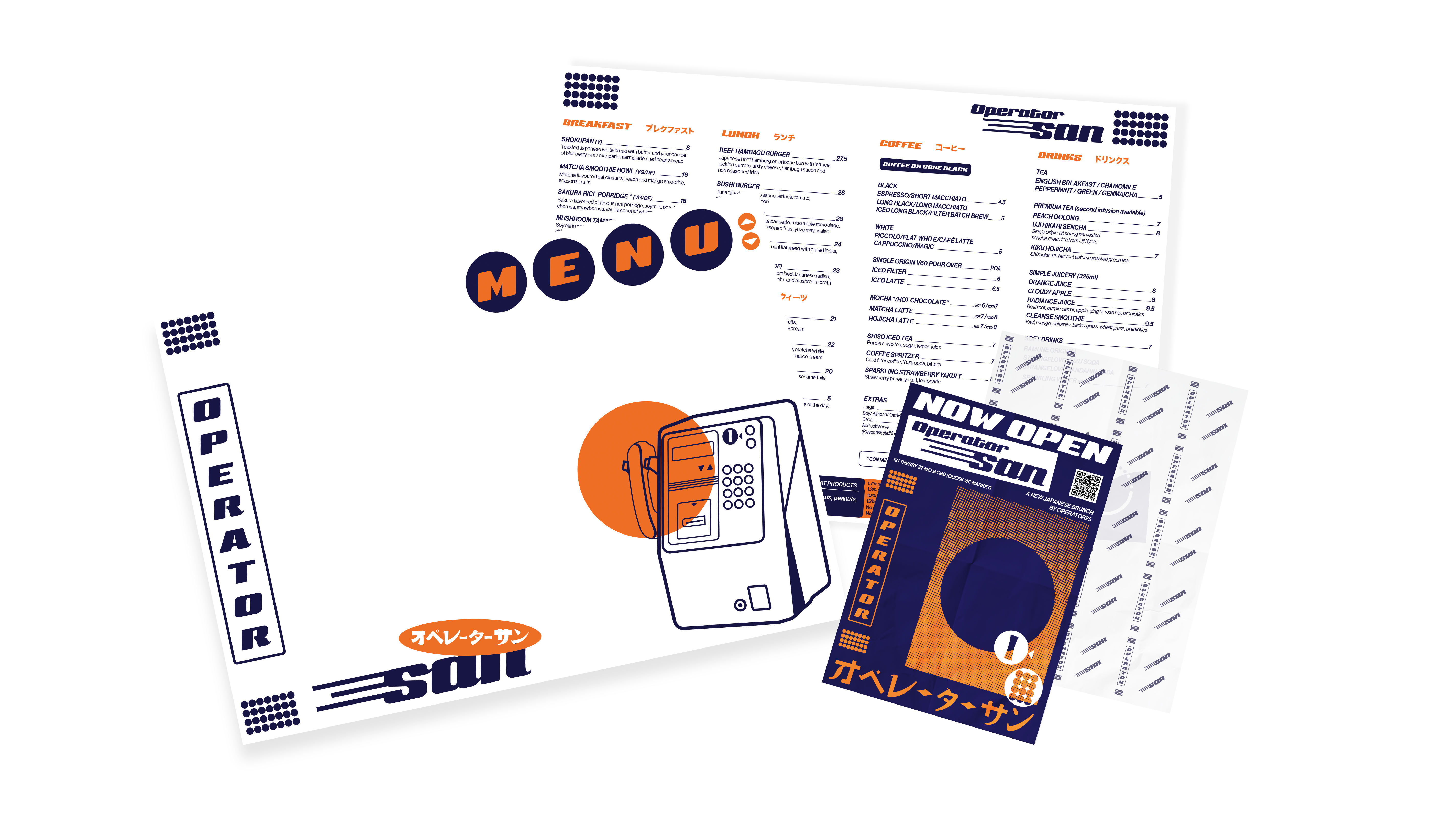
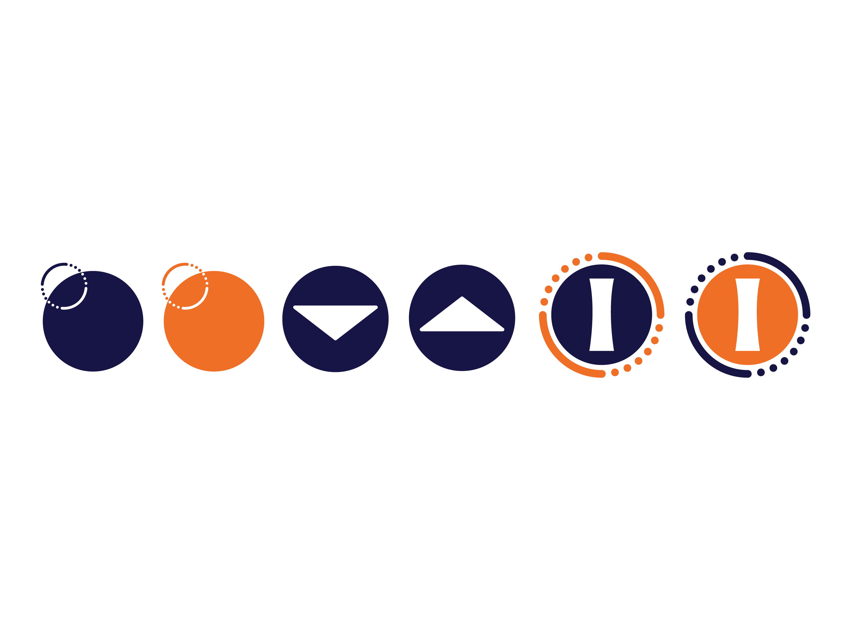
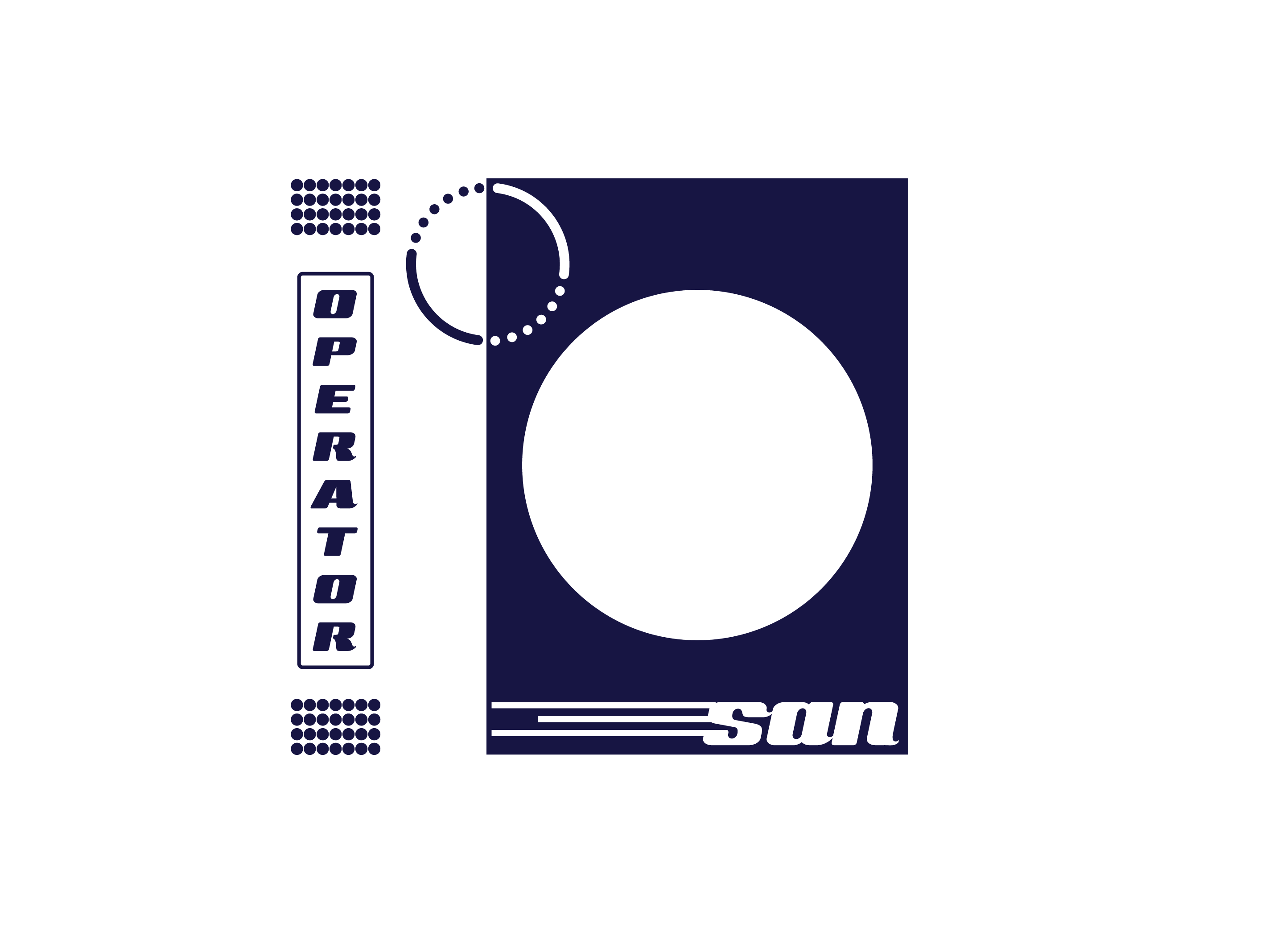
The space draws from traditional elements of Japanese architecture, cross-referenced with ideas from the Operator 25 brand. The Operator 25 name and brand were derived from the café’s location in a building previously used as the control room for Melbourne’s telephone operators. For Operator San we tied the design of the interior and the branded graphics together using similar motifs throughout the space, drawing from the graphic iconography of Japanese payphones while also nodding to the dots on the control panels in the Operator 25 parent branding.
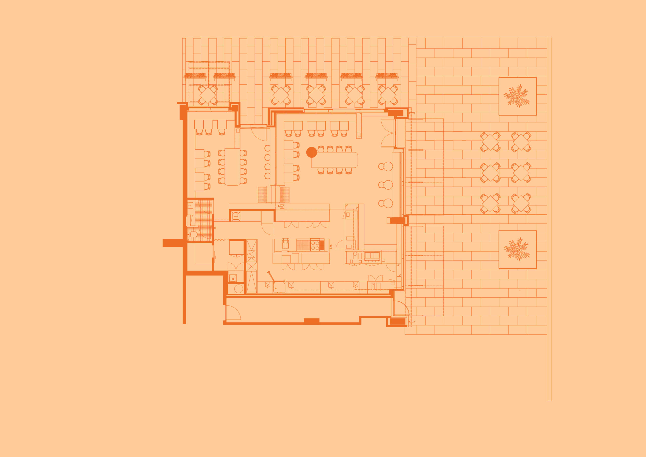
The dining room is divided into two levels by a central screen that allows the café to expand and contract to suit different times of the day. The lower zone is adorned with timber, wrapped in a grid of dots - either as perforations through the blackwood timber panelling or as applied graphic vinyl. The timber is used heavily throughout the interior; the warm blackwood tones create a worn-in atmosphere, evoking a neighbourhood ‘famiresu’ - family restaurant feel. Fabric flags, screen-printed in indigo blue, hang from timber dowels in the ceiling, referencing the ‘noren’ seen in restaurants in Japan and creating an intimate but light-filled dining environment.
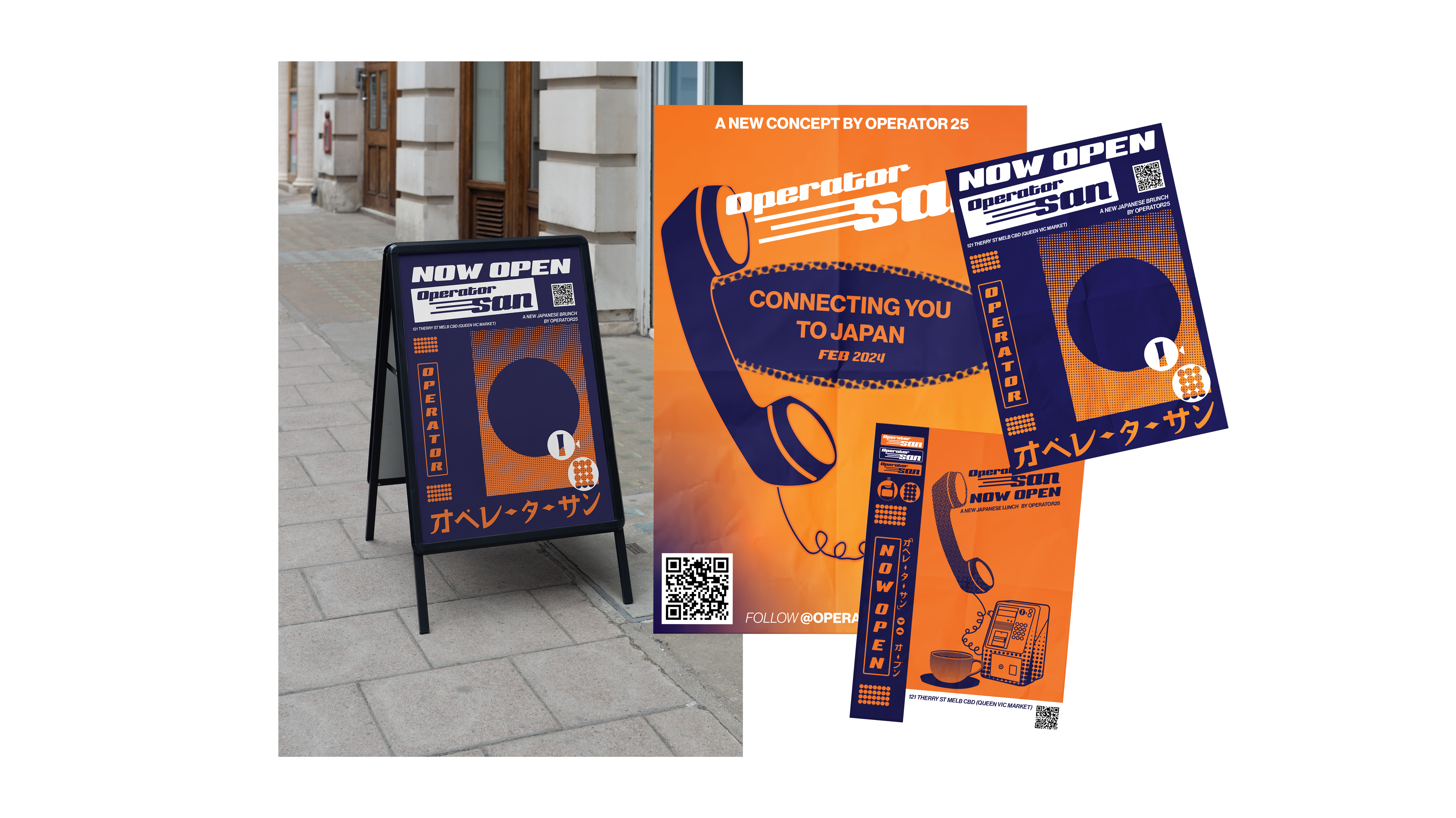
The rear dining room, a few steps up from the main entrance, wraps you in warm brown tones, from the spotted gum timber flooring to the brown paint and tiles on the walls. A hand-painted logo splashed across the tiles in bright orange contrasts against the deep blues in the space. The orange is a subtle reference to the brightly coloured telecom payphones in Melbourne from the 90s, tying the space back to its Melbourne location.
While the vibe of the dining area may be relaxed, the kitchen is all business, clad in stainless steel and off-white tile. It is raised a level, similar to the setup of small izakayas and bars, creating a separation between the diner and the patron without keeping the kitchen behind a wall. The kitchen is designed to highlight the action-packed cooking line at its centre. With the espresso bar pulled off towards the street windows, it creates a takeaway window straight out to the street.
In creating the space for Operator San, a Japanese café in Melbourne, we borrowed architectural design moves from the comfortable yet considered qualities we see in Japanese design and imbued them with a distinctive Melbourne flavour. A space that aims to mirror the culinary experience on offer from the amazing Operator team.


Drawings
1 / 0


Operatorsan Branding Identity
1 / 0